Skip To Content
Work

StrideMobile App, 2026

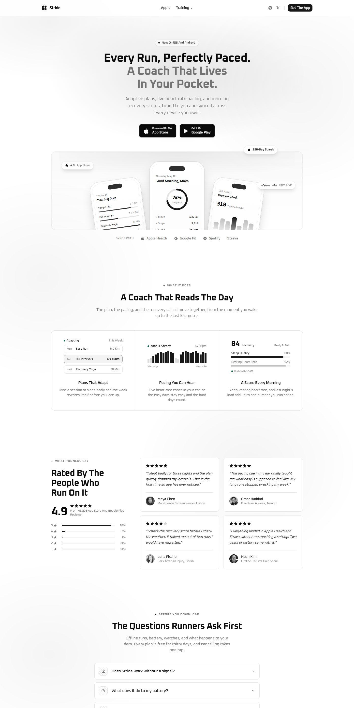
A running app, sold by showing one honest week of training.

A launch site for a coaching app that swaps feature lists for the real screens a runner sees from Monday to Sunday.

Client
Stride, Stockholm
Scope
Design, development
Length
9 weeks
Launched
March 2026

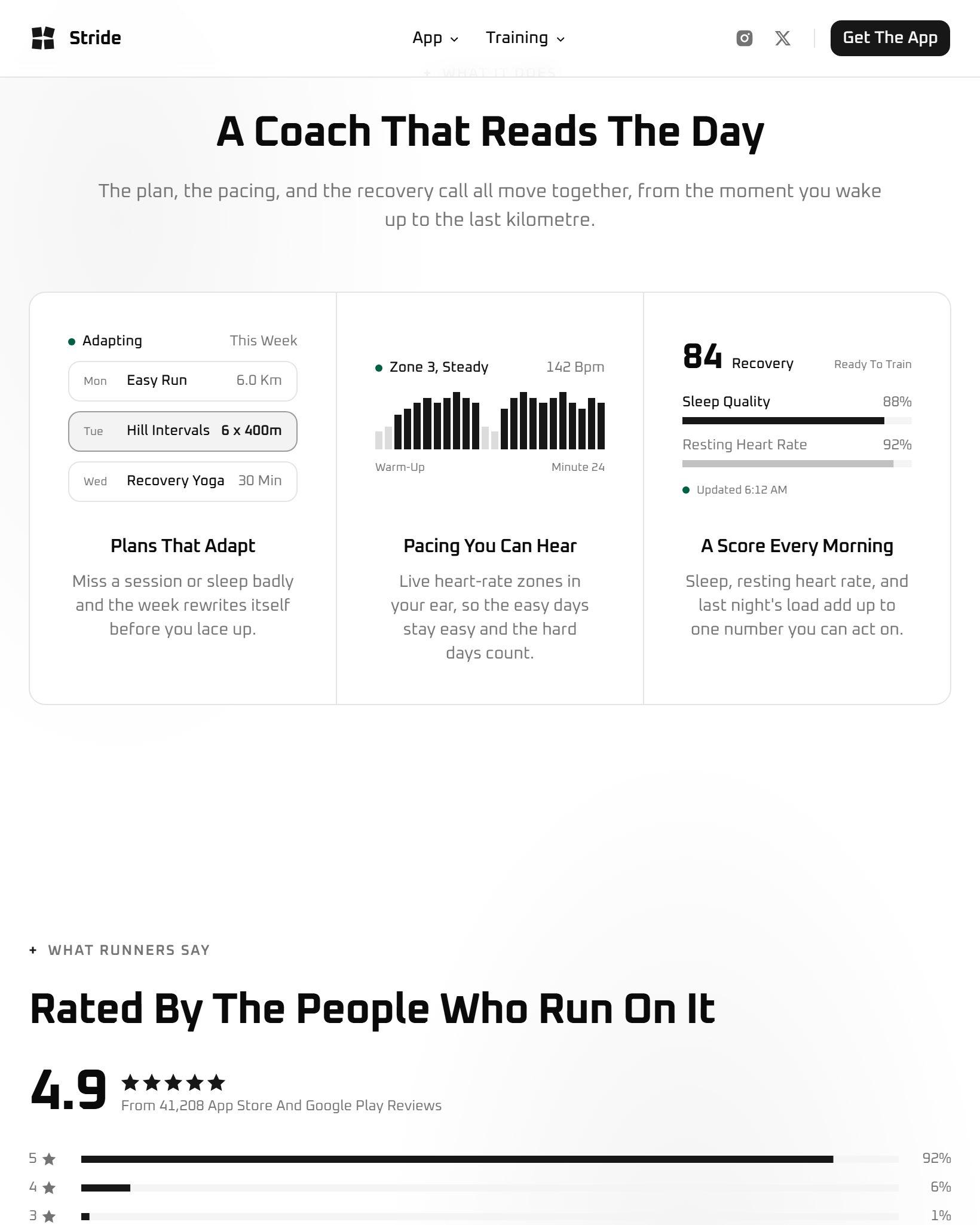
Further down the page, on a tablet

The brief

Stride is a coaching app for runners. Its store page was doing all the selling, and a store page cannot show how a training plan changes over a week.

The founder wanted a launch site that feels like using the app.

What we made

  • A week on one screen. Seven days of real sessions, drawn as the app draws them.
  • Reviews with their rating, pulled from the store so the page never claims more than the store does.
  • A page built for a thumb. Nine visits in ten arrive on a phone, usually from a link a friend sent.

Show the thing working. Everything else is a caption.

How it went

Nine weeks, most of them spent on the three screens in the hero. The rest of the site is deliberately short: one page for the app, one for the training method, and the questions runners ask first.

Stride
The old site described the app. This one lets you feel a week of it, and the installs followed within days.
Linnea BergFounder, Stride
31%
Of visitors open the store
Up from 12 percent
4.9
Rating carried onto the page
Pulled live from the store
9 in 10
Visits on a phone
So it was designed there first

Next project

Ripcord

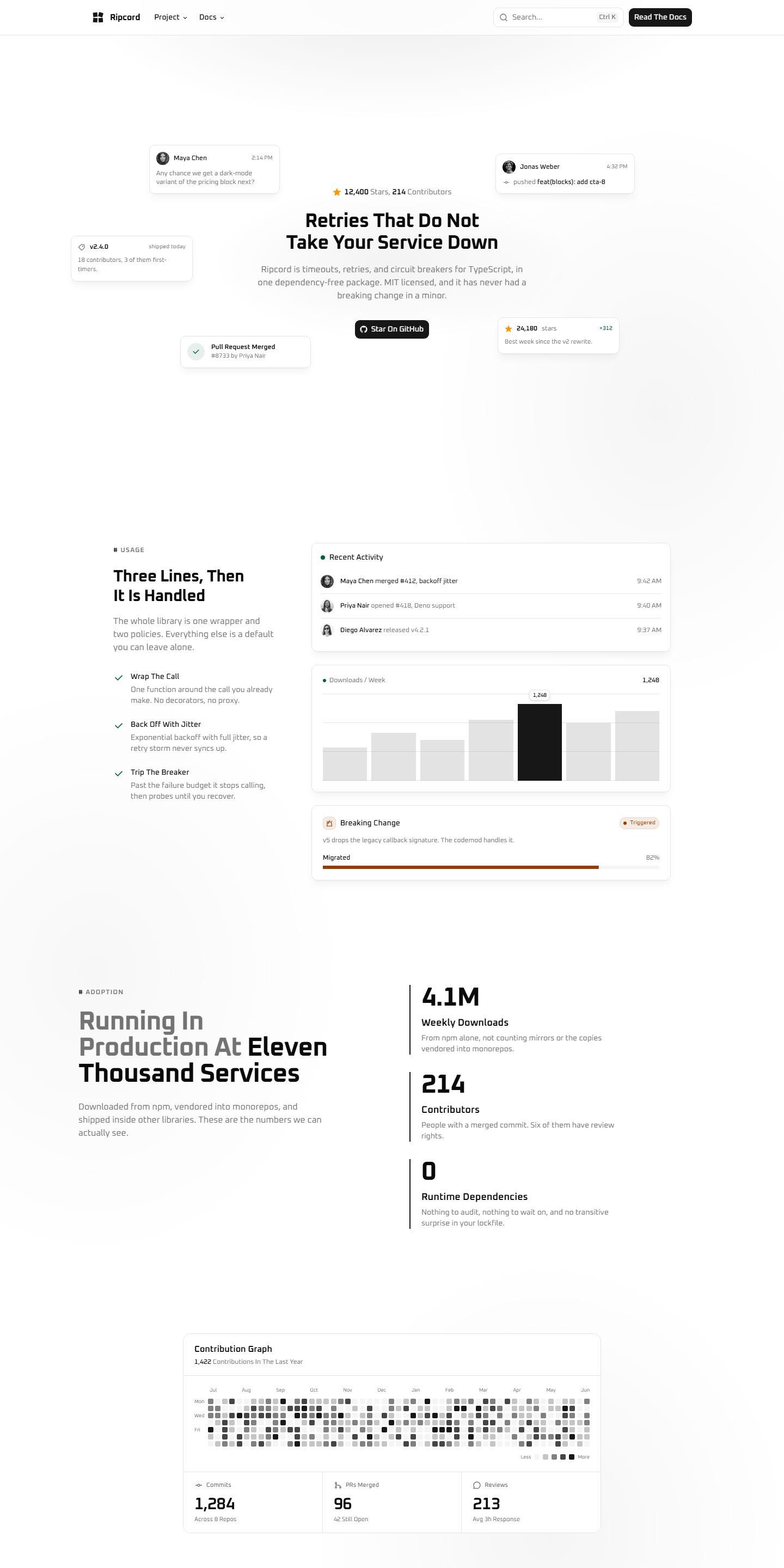
A project site and docs for a retry library, where the install line, the three-line example and the proof it is used all sit above the fold.

RipcordWebsite, Docs2025

Have something worth showing?

We take on four projects a year. The next opening is in February.

Start A Project